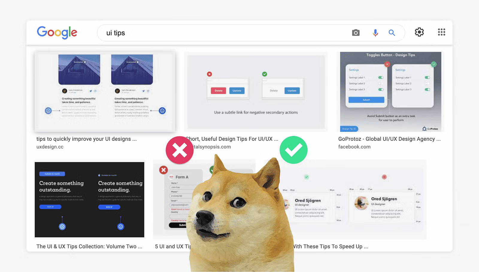
8 best practices for UI card design


A couple more examples of the loading skeleton states:

5. Define a fixed height for cards. In case, you need to design a card element, assuming that one card could have 4 lines of text and another card could have 1 line of text. The best way to approach the card design is to define one height, by leaving the whitespace for the card which has less content and making the text truncated when the card has more content.

6. Use grids for card-based layouts. Grid is a foundation for a card-based layout, they help arrange content consistently, and this is why they are so useful when it comes to card design. You can use a grid for extending the card’s width to the number of grid columns you need, and by doing so, you can find an appropriate width for your card. When it comes to responsive design, you should create a grid for each breakpoint, and arrange your cards accordingly.

You can learn more about responsive grids on Material Guidelines or Intuit Design System.
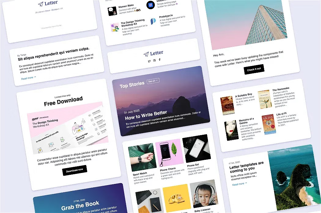
❓🙋 Questions to ask yourself when you design a responsive card-based layout:
Does the card content look consistent across all the breakpoints? (desktop, tablet, mobile)
Are the spacing values for gaps consistent?
Do you consider interactions? Would they affect the card’s size and spacing between the cards?
Do you consider long headings/titles? How would they affect the card’s content?
💁 A few Figma tips for a card-based layout:
Define constraints for cards to determine how cards in your layout should respond as you resize their Frames.
Apply the auto-layout for your card to make it automatically resized according to the items inside. Check out this tutorial from Figma.
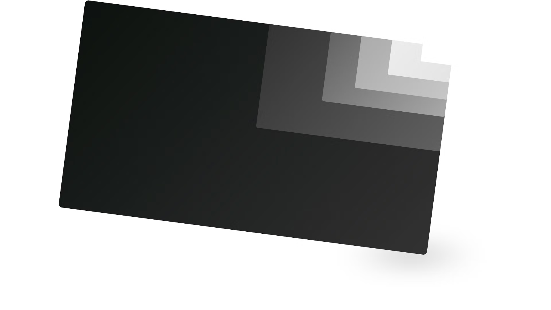
Creating an 8px Grid allows you to arrange precisely and resize elements with 8px increment units in your design. Learn more about the 8pt grid in this great article.
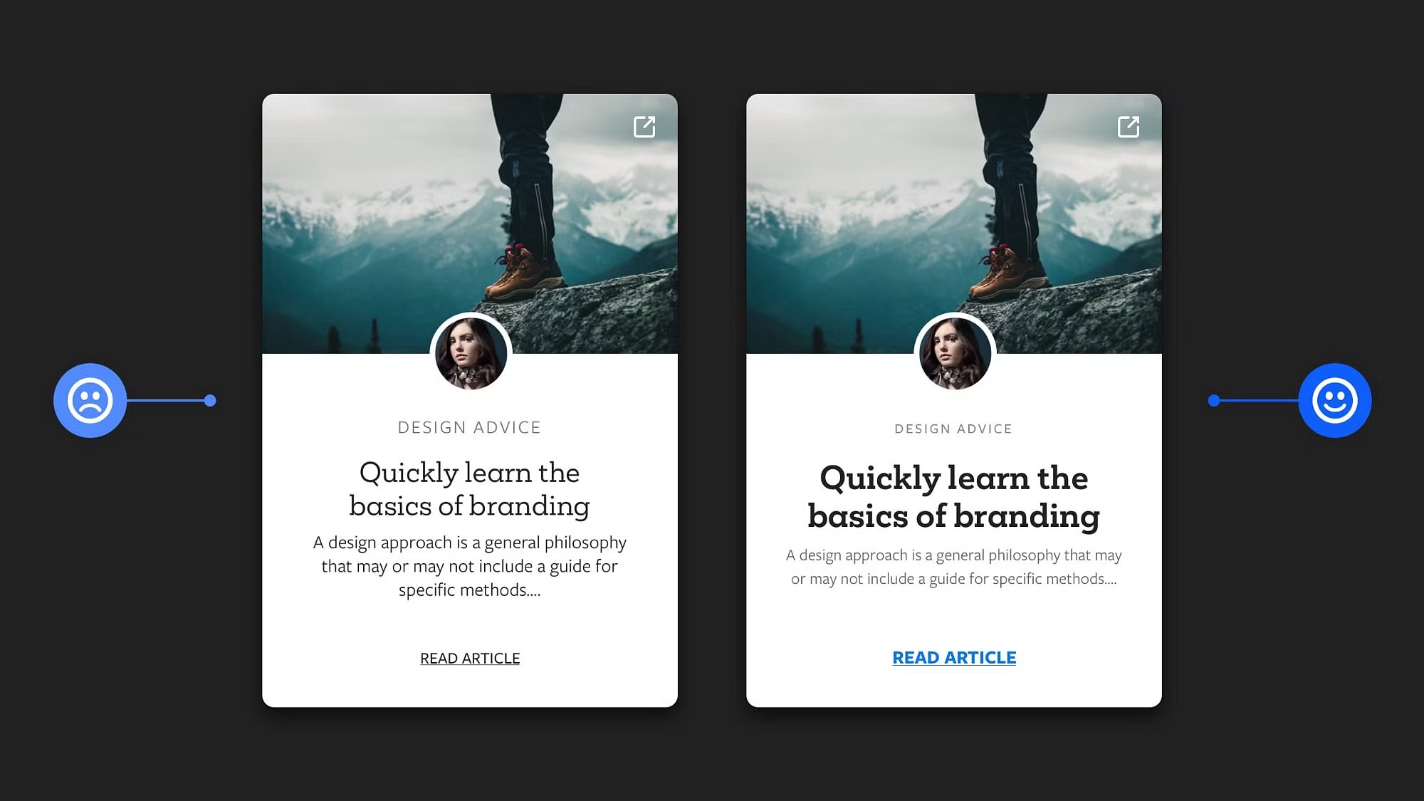
7. Create a card design with different content. If you know in advance that the card may have different lengths of content, make sure to cover this case in your design. In the handoff, this will help the developer to create a code for the card in the correct way and avoid breaking content alignment.

8. Define card interactions for a better user experience. UI interaction is an action that occurs when a user interacts with the UI element through the touch screen, mouse, or keyboard device. The state is visual feedback that appears on the specific user’s interactions.

Like many other UI elements (buttons, text fields, dropdowns and etc.), the cards should have their states depending on the usage context and defined interactions. For the specific interaction, the card should be styled according to the applied state. Let’s take a look at the most common list of card states:
Default: card is in a normal state without any user interactions.
Hover: when a user places a mouse cursor (pointer) over the card.
Active: if the card is clickable, and a user presses down the primary mouse button to click on it, the card’s style should be changed to show up that the component is activated. This is the same state as for Buttons that are pressed.
Focused: when using an input method such as a keyboard or voice, the card is highlighted. Commonly, on the web, blue is used for this state, but you can choose your own that is consistent with the brand, just make sure that the color is at least a 3:1 contrast ratio against the background color.
Selected: when the card is being selected by clicking on the selection control (radio buttons/checkboxes).
Dragged: when users touch and hold a card, using an input method such as a tap or click.
UI Cards are the common components, that you can find in most web and mobile applications, so by learning from each other and sharing good practices, we could make them more visually appealing, effective, and accessible.
I hope you have found this post useful! Feel free to share your feedback, connect with me via LinkedIn or follow me on Twitter. Thank you!

