Are UI Tips the New Clickbait for Designers?✨

It's kinda funny and sad at the same time 🤣
— Michal Malewicz (@michalmalewicz) May 30, 2021

Where did ‘Do vs Don’t’ come from?
I first remember seeing the do and don’t format in a UI design sense from styleguides such as Material Design from Google, and maybe stuff from Apple:

The best ones I read came though came from Steve Schoger back in 2018 with the Refactoring UI design tips and blog posts.
Those older ones are the often the best ones in my opinion. Articles such as, “7 Practical Tips for Cheating at Design” were what I think inspired so many people to start making their own tips. Tips like these were awesome:
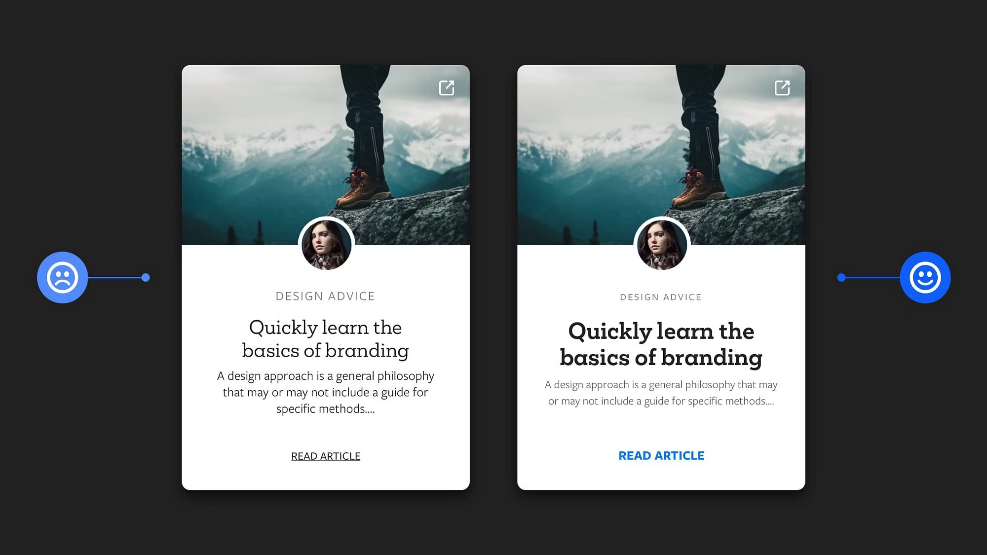
Use colour and weight to create hierarchy instead of size
7 Practical Tips for Cheating at Design by Adam Wathan & Steve Schoger

Rise of the Bait Tips
The above examples came from very experienced teams and designers, and were great because they weren’t contrived:
- ✅ Good tip: They start with a common issue that really existed as the ‘don’t‘ part, and then told you how to fix it in the ‘do’.
- ❌ Bait tip: Bait UI tips feel like they’ve come up with the ‘do‘ part first, and create an intentionally dodgy looking design as the ‘don’t‘ counterpart. (I may be wrong, but that’s the feeling I get)
Both the above (good vs contrived tips) look the same, but the clouting versions lack authenticity and often don’t make sense to me. Anyone can create these tips and share them, so check where they’re coming from, as Michal Malewicz puts it:
I think I have to rethink UI tips and start my own series, but without these mistakes.
It's not going to be easy, as there's a lot of factors to take into account.
— Michal Malewicz (@michalmalewicz) June 2, 2021
And he’s actually started his own series of research-backed tips. Here’s his latest that are “not copied from Instagram”, and based on real world products he’s designed in his 20+ years career:

Or…Just use Comic Sans
I don’t think there’s any bad intention from anyone creating UI tips, but if you are learning, make sure you get them from reputable sources:
- ✅ Check their previous experience
- ✅ If they’re sharing UI tips, make sure they are UI designers
- ✅ See if they have a portfolio of this work
The above points are especially important because there’s a lot of copied material out there. For instance:

In the end, the best way to get better with anything is practice. To paraphrase Refactoring UI:
UI Tips improve your designs with tactics, not talent.
And for a final important tip, ❌ don’t ask me for UI tips:

The intention from this article is just to spark some thought, and guide people to trustworthy resources. Keep making your tips and keep learning!
Thanks for reading, good luck!

 Buy me a coffee